
One of the most important stages of planning out the app is picking a colour theme that goes with the idea of the service design, the colour theme should bring enjoy to the app and highlight the app in a better light. through the last 3 years I’ve learnt a lot about colour theory and the psychology of how each colour represent something different and just like any other project this an app has to have the right colour to set the tone for example I knew I wanted to avoid Red as red is seen as danger and wanting plus with my theme it represent blood, I just don’t think it will fit the app.
One of the colour I did think about using at the star was Pink but I really wanted to think of another way to make a tone for my app and I felt pink was too typical and expected in my theme issues that’s just females base audience users so instead of being very typical based outcomes I really wanted to explore another colour choice and and go from there.
to start off with picking some colour, I found that a colour that makes me feel really calm and visually appealing on the eye was purple so I really wanted to try out this colour so the best way to start this was going into procreate trying out different tones of purple to see which I preferred and would take forward to take into my development of colour choices.
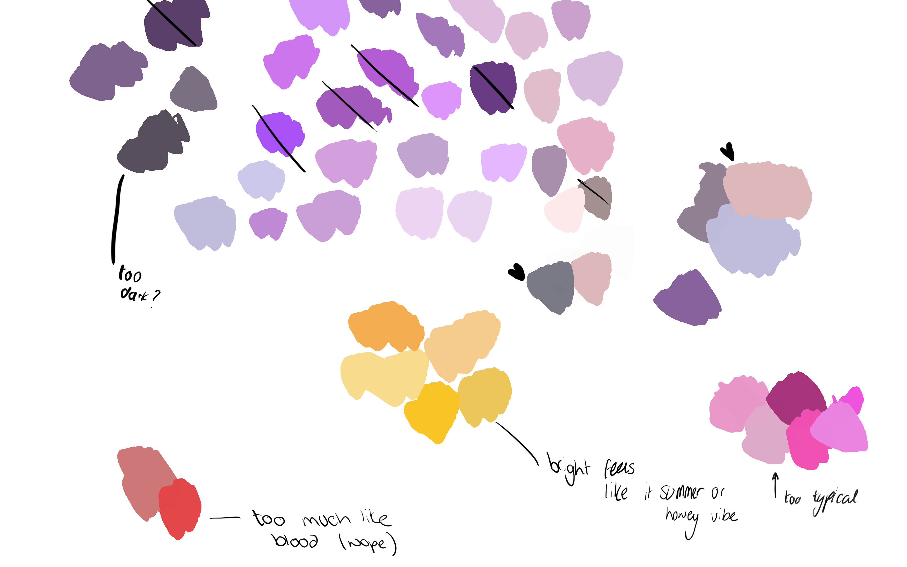
Above is the colour swatches that done on procreate another colour theme that I did think about was merging yellow and another colour theme but I just felt the colour yellow didn’t really fit into my topic that much yellow just make me think of summer and honey and felt it. didn’t have any connect to women health or making them feel calm. In thee purple mix there was purple that I really didn’t like and theses were often the darkest or bright purple looking at them I personally feel that they would fit in that well with a app design colour they might be too dull or too playful and take the tone of the message of the app away.
After making swatches in procreate I decided to make the colour swatches into illustrator were I started to play around with the purples and see I could come up with a colour theme that can be used or explored more, I came up with a handful or different trials and theses are what was there on my pages, I feel that the dark purple really doesn’t work that well with my idea because of the app I want the place to be calm place for users to feel supported and get educated about their body and not feel overwhelm where a dark colour could really make the app dark or too make the tone not fit compared a light colour.
while I also said at the start I wanted to avoid using pink I found I really feel in love with the nude pink tones and felt that they would really benefit my colour theme but the the other types of pinks I would avoid for being to cliché but the nudes were simple and could help make the more of a classy look, After mixing a lot of the purples I felt about trying out adding the the pink/nudes to my mix of purple to see if anything else would work better and explore the idea as you never know it could work ( theses were on bottom left and the right side below)
After speaking to people outside of graphics and my peer Emily they really thought the mixture of the pink/nude and purple worked the best and could be something to take forward into my app and see if it does work if not I could always come back to the colours below and pick another theme and go form there but I personally think the top right colour theme works amazing and the right bottom but the colour theme I want to explore more is the colours on the bottom left.

